


 Cart
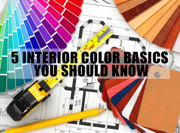
Cart 5 Interior Color Basics you should know
 Home Decor
  December 22, 2014
 Comment (1)
Saying that color is vital to your interior décor is as redundant as… saying words are important for reading a book! And the color or colors you choose for your interior not only play a vital role in determining whether your design is aesthetically appealing or not, but their inherent phycology helps to create interesting visual illusions and emotional undertones adding a lot more character to your space. Here a few quick pointers.
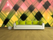
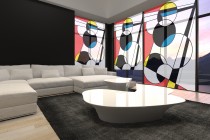
Bright Colors
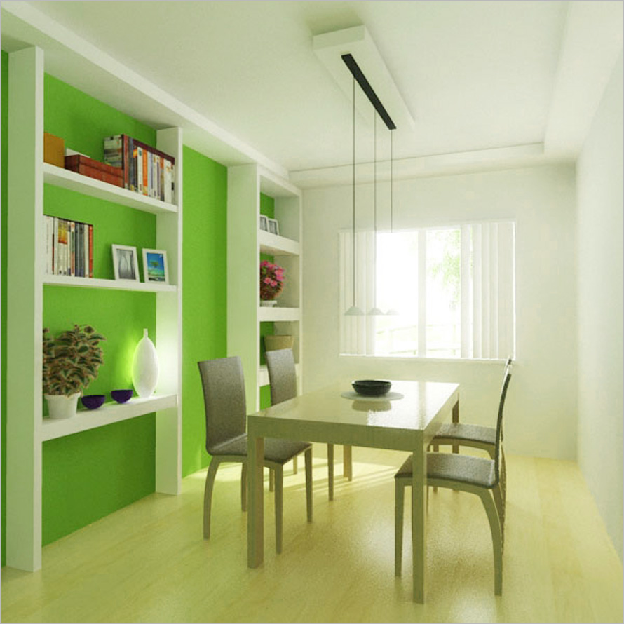
These are great for providing an expansive feeling to your interior. We’re talking about nice and bright shades of green, blue, yellow and orange. These are fresh and happy hues that inspire communication which is why you’ll almost always see these hues n places like dining rooms, restaurants and early learning centers for children.
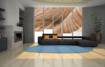
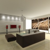
Dark colors
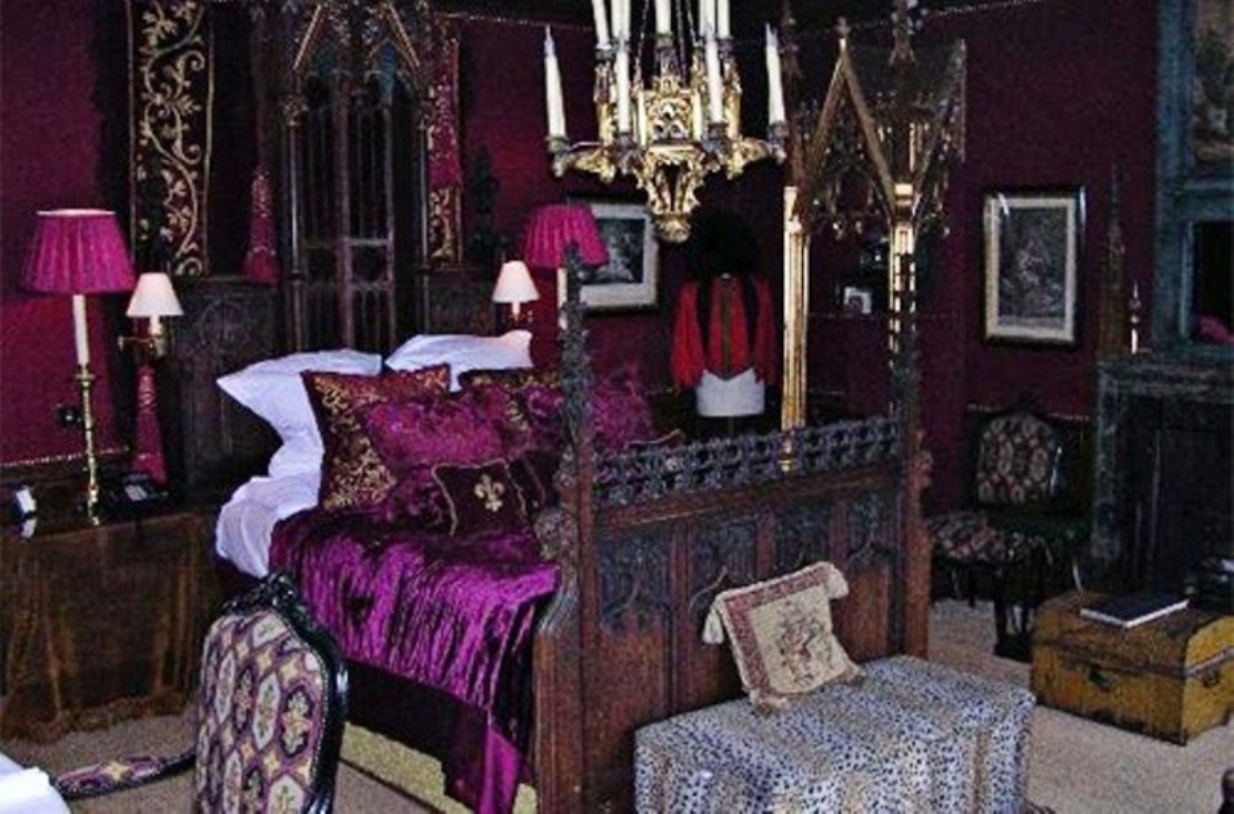
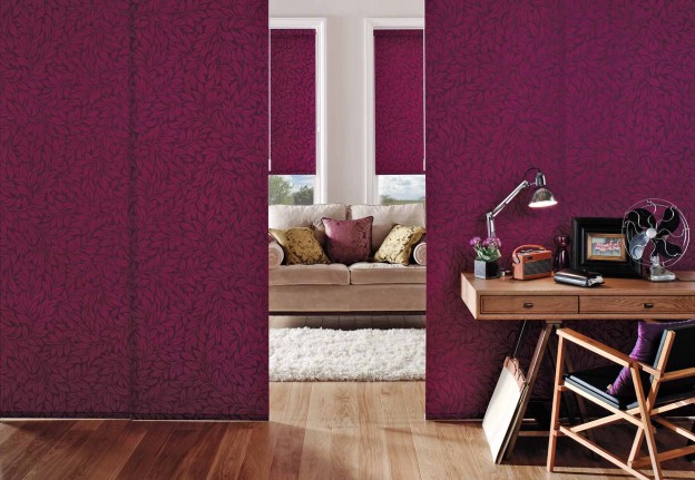
Deep red, purple, navy, black and darker shades of green tend to create a gloomy and constricting effect. This isn’t necessarily a bad thing; if applied at the right place, in the right quantity, they can be quite comforting while conveying a sense of security. Also… when paired with neutrals in a bold manner such as a full wall or a roller blind, they can help create very interesting focal points and a lot of character to your interior.
Warm colors
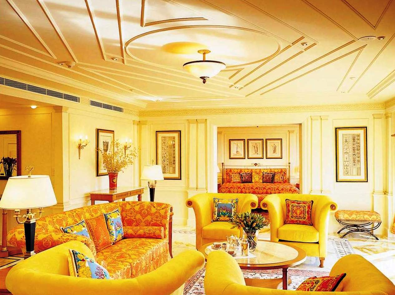
These are lighter and brighter shades of yellow and orange which help raise the perceived temperature of the space… and by that we mean that the space just looks warm instead of actually turning into a hot case! And because these hues tend to make an individual feel more active than normal, the last place you’ want them is your bedroom.
Cool colors
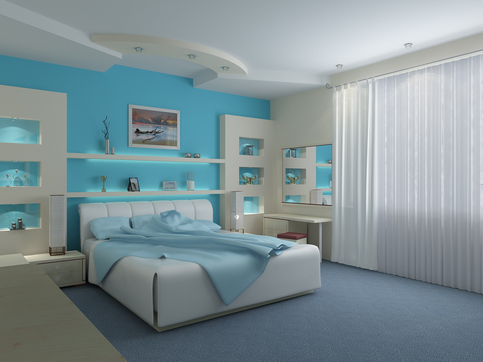
We’re talking about icy blues and min green… they have a calming and chilling effect and serve as the exact opposite to warm colors… meaning they convert your space into a refrigerator! Uless your up for the typical girl and boy shades for bedrooms, these are your next best bet for creating that perfect bastion of slumber and sloth; very relaxing and soothing indeed!
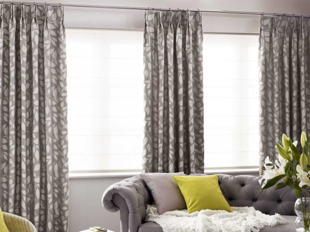
Neutral colors
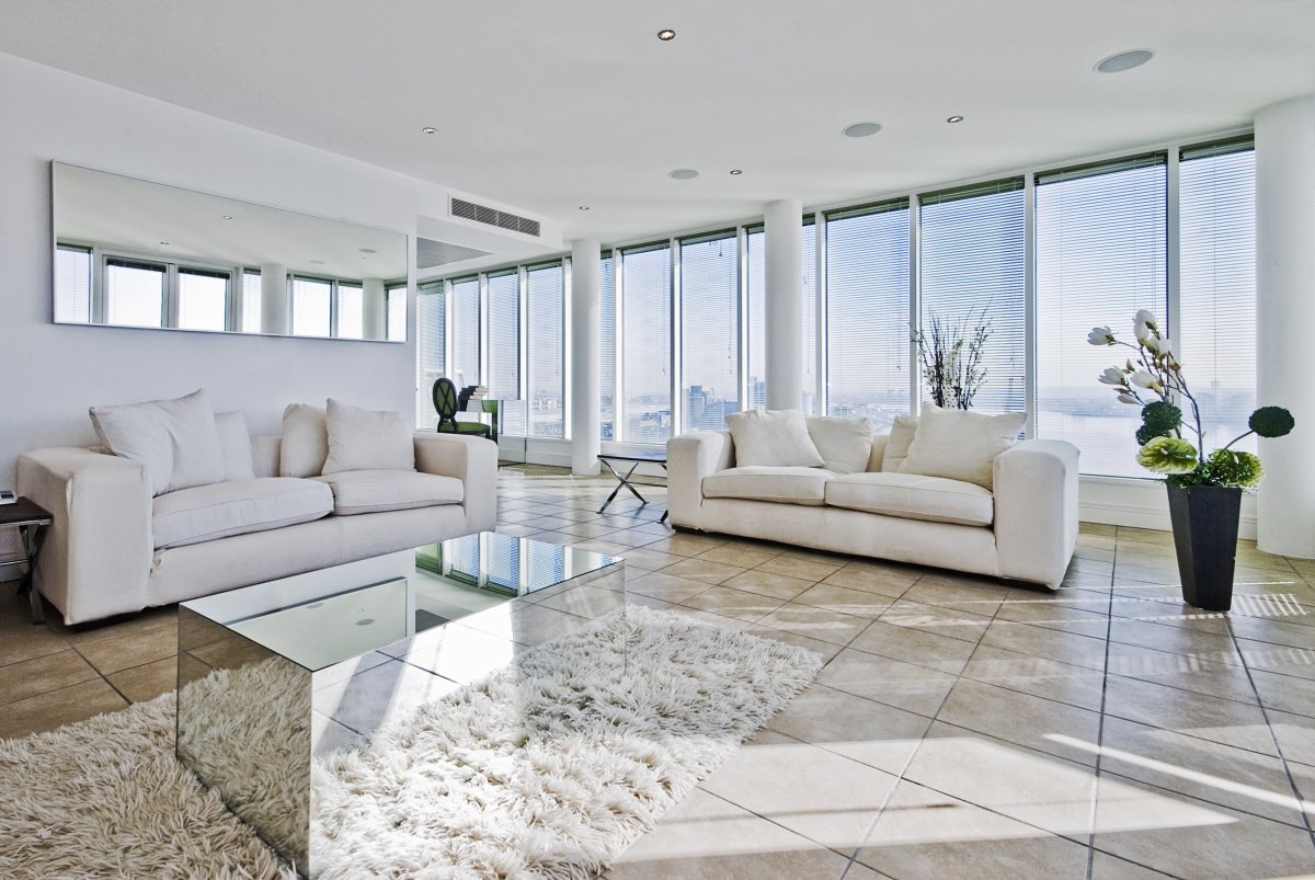
Whites, greys and the brown family… these tones help balance out all the other colors in your décor. You can create elements of contrast by keeping these tones to a max and using another color in selective focal points like a blind or a wall or a piece of furniture. Or in case you’re using more than one hue to do your interior, then you might want to throw in one of these neutrals to tie everything together and prevent the space from looking too hotchpotch! And if not that… go for a full neutral them and play with textures instead of color for some super luxury decor.


Pingback: Easy Tips to Transform Your Home to a Fun Space | Industrial Talks